FRED
Creature
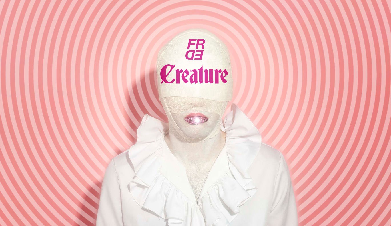
It was such a pleasure to work with the pop musician FRED on their next iteration of self. Taking a departure from their previously established brand, we journeyed to the intersection of classic horror and urban beauty. Over a 3-month period, a new persona was crafted, a photoshoot was remotely directed, FRED branding was updated, and visuals were designed for digital & print PR.
Roles
Creative Direction, Branding & Visual Design

Art Direction
Starting with the classic horror of Nosferatu and The Twilight Zone, we tempered the fear-factor with nods to more stylized icons like St. Vincent and Tilda Swinton in Only Lovers Left Alive. Together we sculpted a drag noir persona that is equal parts alluring and alarming.
Existing FRED Branding
Splattermark
Lacquermark
Branding Revamp
FRED’s Creature branding lives somewhere between the blood & guts of horror movies and the alluring splatters of nail polish advertising. Inserting the existing FRED logo into a flat vector splatter (the Splattermark) and pressing it into a trompe l'oeil pink lacquer (the Lacquermark) allowed for a graphic expansion of the FRED branding.
IG Story
Utilizing FRED’s IG as our primary channel of engagement, we prepped the audience for their first taste of FRED Creature. Here we see FRED’s take on the classic horror Nosferatu pose paired with the new FRED branding and bubblegum-pink type.
Singles & Cassettes
Working with FRED’s updated branding and a tried-and-true horror typeface Deutsch Gothic, visuals were created for digital and physical music distribution.


